|
|
For those of us that like to see graphs, these are really neat... and they tell us where the market is and -hopefully-
gives us an idea of where it is going. Some Data below comes from the M.L.S., some from C.S.S.
Of course, this
information is deemed reliable... but not Guaranteed
If you have any questions/comments, or if you'd like to see any
other graphs, please email me by clicking here
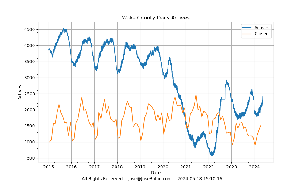
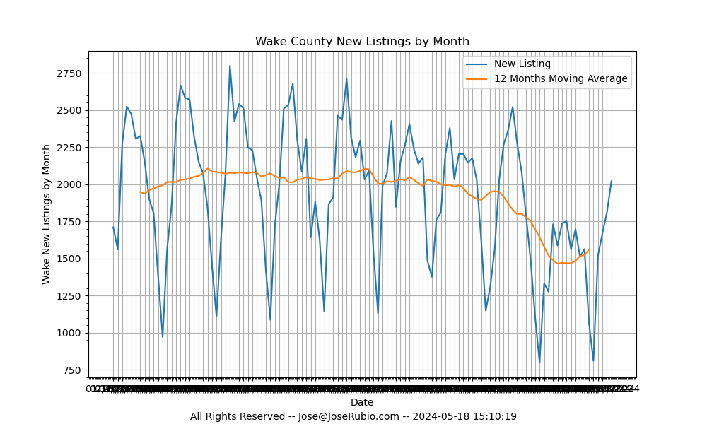
 The graph above shows the Inventory and the number of sales. It's a graph of the closed homes for a given
month (blue line) and a graph of the number of "Active" listings in red.
The graph above shows the Inventory and the number of sales. It's a graph of the closed homes for a given
month (blue line) and a graph of the number of "Active" listings in red.
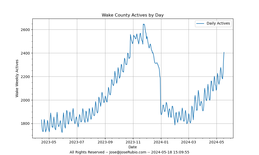 This graph simply "zooms" in on the "Actives" above. Showing a bit more detail.
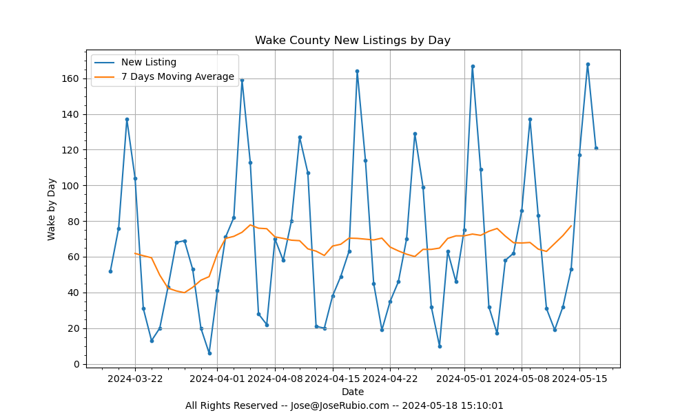
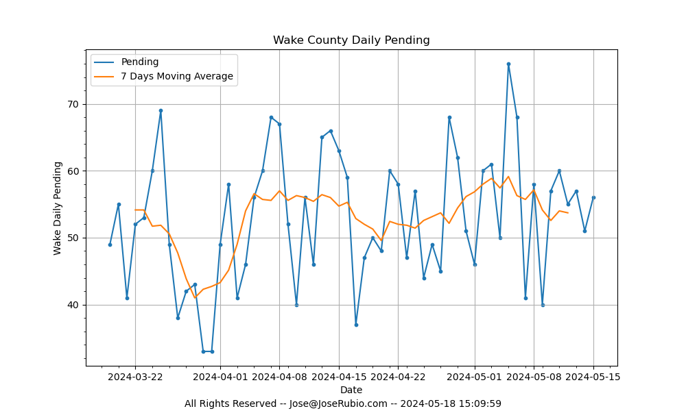 This graph shows the number of homes that have gone Under Contract on a daily basis.
This really gives a good measure of what the market is doing "right now".
Note however that the last few data points are low because agents do not immediately
update the MLS when a home goes under contract.
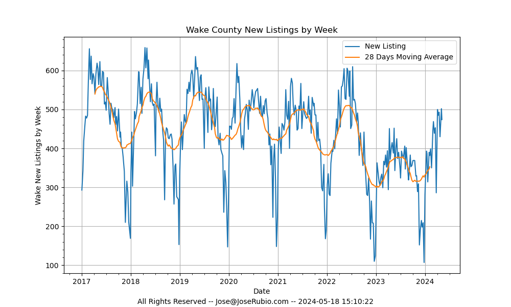
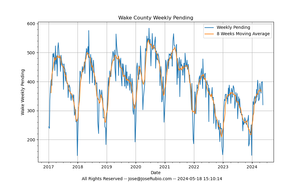 This one shows the number of homes that have gone Under Contract on a weekly basis.
Don't trust the last point too much, if the graph was created early on a Tuesday, it only includes
one day worth of data.
This one shows the number of homes that have gone Under Contract on a weekly basis.
Don't trust the last point too much, if the graph was created early on a Tuesday, it only includes
one day worth of data.
It is also a good measure of current market activity and without as much "noise" as the previous graph.
Note again that the last few data points are low because agents do not immediately
update the MLS when a home goes under contract.
 This one answers the question everyone's been asking...
How does all this affect the price of my home?
This one answers the question everyone's been asking...
How does all this affect the price of my home?
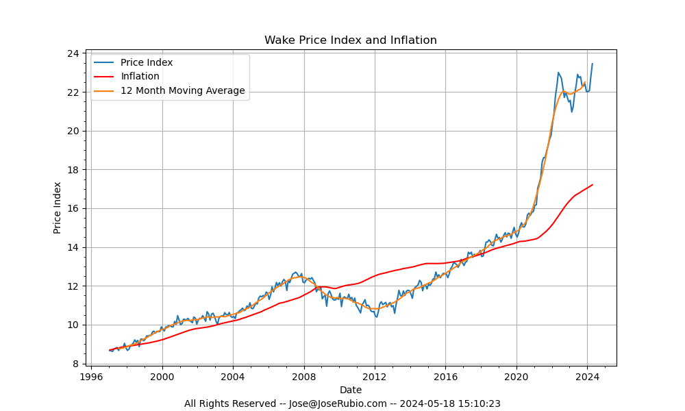
The price of any particular home is hard to calculate and must be done on an individual basis. What I did here was
to calculate what I call the Price Index, in which I try to take into account different areas and locations and also
the different ages and qualities of construction... and then I average them all out to get an index.
This graph is the Price Index for homes in the area. I also graph its 12 month running avarage to smooth
out variations due to different seasons. Lastly I compare it with what inflation has been doing.
As a warning though, do not trust the last point. This graph uses monthly data and for the curent month
the data is -of course- incomplete. Additionally, most closings take place near the end of the month and the data in
the MLS runs a few days late, so it is not until a few days after the end of the month
that the points are accurate.
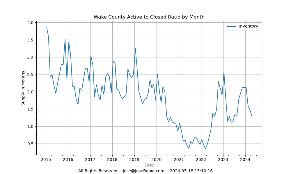
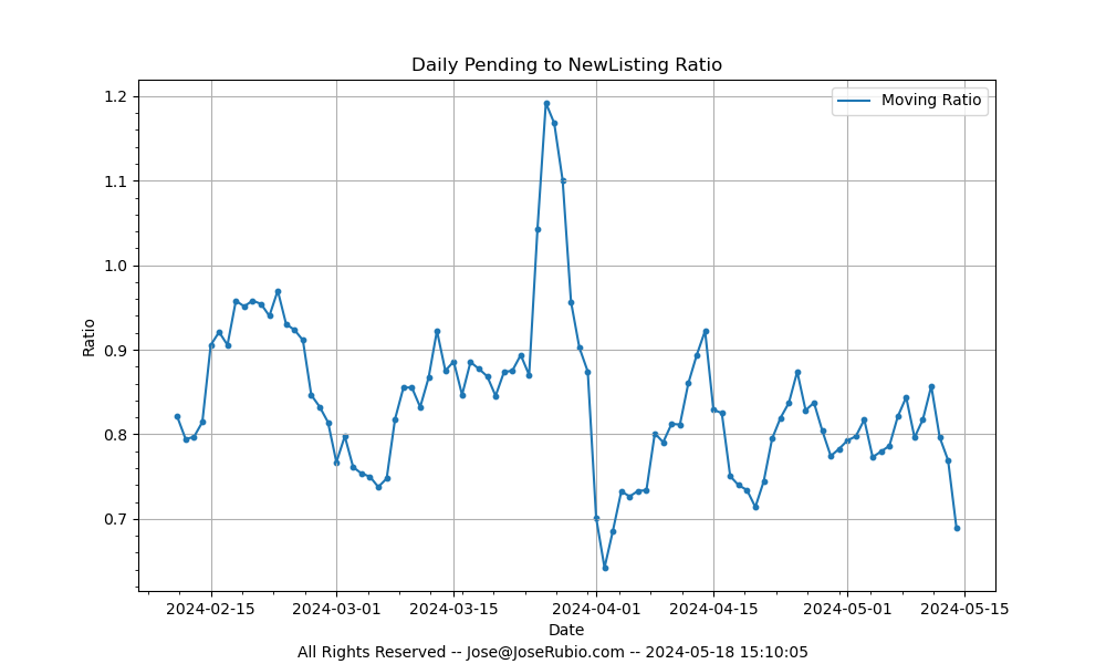
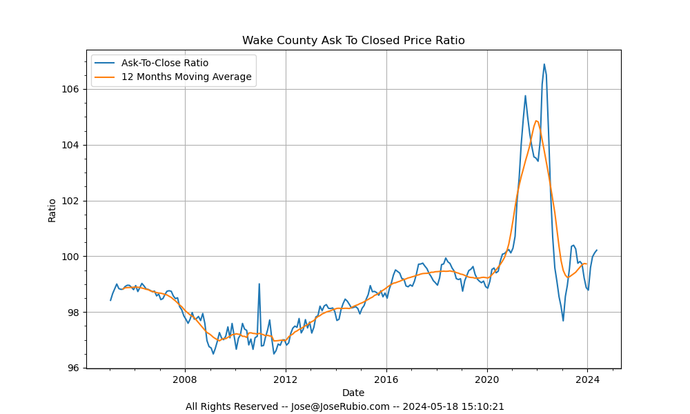 This one is also interesting. It is the ratio of AskingPrice to SoldPrice. One thing to note is that
it does not include seller paid closing costs.
This one is also interesting. It is the ratio of AskingPrice to SoldPrice. One thing to note is that
it does not include seller paid closing costs.
 Email me by clicking here and let
me know what you think. And also let me know if there are any other graphs you'd like to see!!!
Email me by clicking here and let
me know what you think. And also let me know if there are any other graphs you'd like to see!!!
|
|